ReBreath ✨
Onboarding for a CBT-Based Quit Smoking App
A Soft, Flowing Start
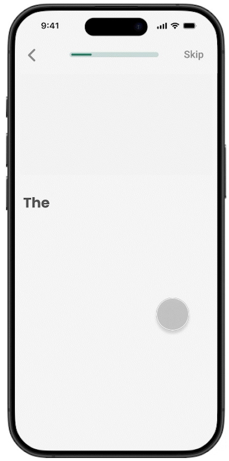
Emily (the app's virtual therapist) introduces herself and asks for the user’s name, creating a natural, conversational tone from the very beginning. Personal details are collected gradually as part of the chat, keeping the experience smooth, reducing cognitive load, and reinforcing user engagement.


Feedback
Whenever the user enters an incorrect code or performs an invalid action a soft bell animation appears. It offers immediate, intuitive feedback without interrupting the flow or making the user feel like they failed.
feedback
Instead of using a harsh, alarming red, I chose a soft reddish-pink tone. It communicates the error clearly, but with a friendly and gentle visual tone that keeps the experience smooth and emotionally comfortable.

Ready to Begin
In the final screen, Emily shares all the key information the user needs to get started without requiring any taps. She explains features like scheduling sessions, support access, and the program structure, with an option to hear it aloud.
At the same time, she reinforces the user’s confidence and encourages them to feel like an active part of their quitting journey.
At the same time, she reinforces the user’s confidence and encourages them to feel like an active part of their quitting journey.
Challenge
ReBreath is a mobile app designed to help users quit smoking using CBT (Cognitive Behavioral Therapy), guided by a supportive AI therapist. When I joined the project, one of the core challenges was user retention: many users dropped off during the onboarding stage. The existing flow lacked emotional connection and failed to clearly communicate the app's purpose or value from the very first moment.
Goal
My mission was to redesign the onboarding experience in a way that would:
1. Clearly communicate the app’s therapeutic value.
2. Build emotional engagement from the first interaction.
3. Keep users active and motivated through the process.
4. Feel personal, supportive, and non-generic.
Process Designing a Conversation, Not a Flow
I approached the onboarding not as a series of screens, but as a conversation. Drawing from principles of behavioral design and CBT itself, I created an interface that simulates a real-time chat with “Emily” an AI therapist. This decision was based on several insights:
✔️ Human warmth builds trust. Starting the app with a friendly, responsive figure makes users feel seen and guided.
✔️ Feedback drives commitment. Real-time responses give users a sense of progress from the very first second.
✔️ No friction. No confusion. The flow is designed to be intuitive and welcoming, free from cold forms or unclear jargon.
I sketched multiple flows, tested microcopy to find the right tone (encouraging, empathetic, clear), and worked with developers and product managers to ensure both feasibility and fidelity to the therapeutic goals.
Solution Conversational Onboarding With Sarah
The final onboarding experience mimics a natural dialogue:
💡Users are welcomed by Sarah, who asks simple, human questions.
💡 The interaction is designed to mirror therapeutic empathy — not a typical setup wizard.
💡 The visual UI feels clean and supportive, using calming tones and accessible interaction.
💡 The chat adapts to user choices, immediately giving them a sense of personalization.
💡 Within two minutes, users already understand the value, set a quitting goal, and feel emotionally invested.


Impact
This redesign significantly reduced onboarding drop-offs. By making users feel like someone is there for them from the very beginning, we not only improved user experience, but also increased the percentage of users who completed the first week of the program a critical metric for long-term success in health-related apps.
Reflection
This project taught me the power of emotional UX. Sometimes, the difference between an app that helps and one that changes lives is not the feature list — it's how it feels to open it for the first time. By designing ReBreath's onboarding like a conversation instead of a form, we gave users hope, clarity, and motivation in their own language and at their own pace.